Humans are visual creatures, which is exactly why certain designs resonate while others go completely unnoticed. Understanding the human psychology side of design and the science behind why certain designs are eye-catching is a powerful tool.
The success of a design is achieved when a designer applies psychology throughout the design process. This knowledge is based on a deeper level of understanding of the user’s perception and target audience. It will help guide users to perform key actions, including purchasing or contacting the company.
Understanding and utilizing the science of design psychology to create designs well is beneficial. So the real question is, how? Keep reading the following article for design and behavioral psychology, tips and tricks that will transform your design and offer users a design that naturally guides them toward a specific action and catches their attention.
Successful Design Psychology
The crux of a successful design hinges on the understanding that design is a form of communication meant to speak to a specific user. This requires a deep understanding of the user’s challenges, motivations, and aspirations, as well as an interest in developing and understanding the end-user.
During the design phase, you need to consider why, what, and how. When asking the ‘why,’ this is all about a user’s motivations. Does it relate to a task they want to perform? Does it resonate with values or a specific lifestyle? The ‘what’ addresses its functionality, and the ‘how’ directly impacts that functionality by balancing accessibility with aesthetics.
One of the best ways to implement design psychology is to practice empathy and observe them without imposing our assumptions or knowledge onto them. Simply take a step back to measure the success or pain points real users experience from their perspective. Your goal is to design a process that engages the user’s attention while guiding them to complete a desired task or action, so understanding what motivates the average person and engages them is crucial.
Design Psychology Principles
When your design process accurately reflects the needs and wants of the end-user, it results in better products, services, and internal processes. As with any design element, the focal point should always be, “What’s the human need behind it?”
There are a number of effective design psychology principles that, when applied to the design process, will lead to successful results. There are many ways to elevate your web design more quickly, such as creating design patterns, creating organized and intuitive designs, implementing color, guiding the user, etc. Here are just a few recommendations:
The Psychology of Color
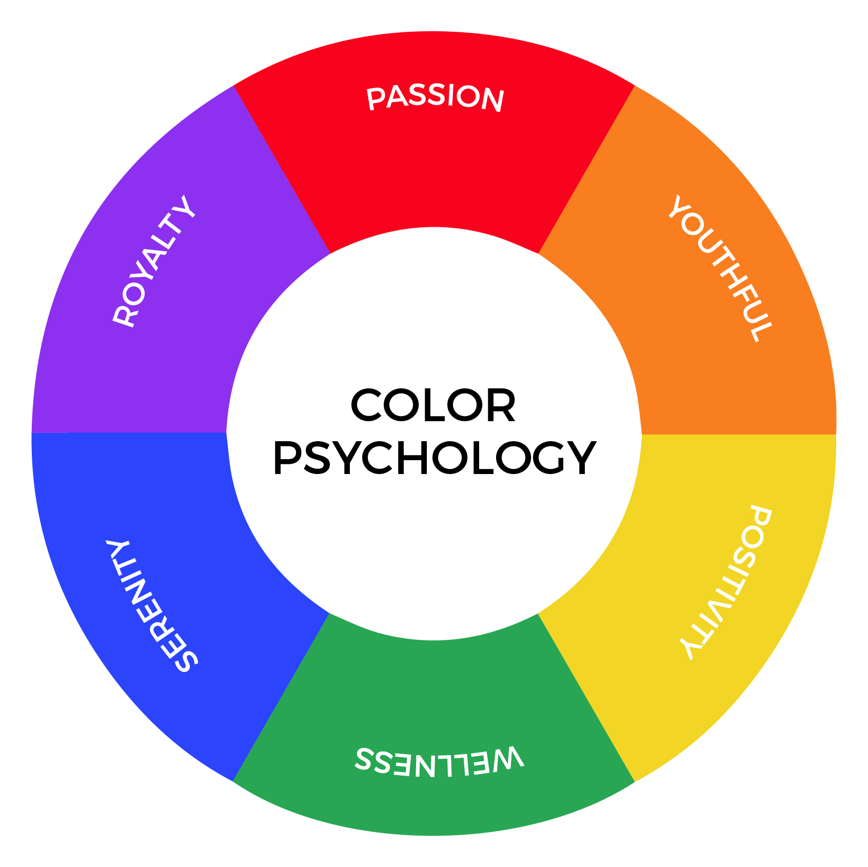
Choosing the appropriate color or colors is vital to your success. Choosing the right color will evoke a positive reaction, but a poor color choice can negatively impact your success. Getting it wrong may mean a superb product or design is dismissed or ignored.
Color directs our attention. It influences visual perception, where to look, what to do, and how to interpret something. Furthermore, it impacts what a potential user sees, how they feel and hence directly influences their own decision making. Ultimately, it helps us decipher what’s important and what’s not important.
Subconsciously, we associate different colors with a different set of emotions, human behaviors, and reactions.
a). Red
Create a powerful presence or get someone’s attention quickly with red. Red physically stimulates the body, raises blood pressure, increases the heart rate, and stimulates appetite. When used effectively, it portrays friendliness and strength and is often associated with movement, excitement, and passion.
Fast-food chains frequently use it for clearance sales, safety products, and designs meant to symbolize love or passion. Use it sparingly to avoid negative reactions.
b). Blue
According to market research, men prefer blue. Unlike red, blue evokes a mental reaction as opposed to a physical reaction. Blue is associated with peace, tranquility, and reliability. It brings to mind a sense of security, curbs appetite, and stimulates productivity. Brands commonly use it to promote trust in their products. If overused, it can be perceived as distant, cold, or unfriendly.
c). Green
Green is associated with health, tranquility, power, and nature. It stimulates harmony in the user’s brain as it reflects life, rest, and peace. It is also a sign of growth, whether that’s physical with plants or in our income and sense of wealth. Green is successful in stores, designs, and products that intend to relax users and promote environmental issues. When overused, it can evoke a sense of materialism and greed.
d). Purple
Purple is commonly associated with several attributes, including royalty, luxury, wisdom, loyalty, respect, courage, magic, mystery, imagination, and spirituality. It evokes a sense of intrigue, as it both soothes and presents space for mystery and new ideas.
Since purple is a blend of red and blue, it perfectly balances red’s energy and power with blue’s stability and reliability. It is frequently used to promote beauty and anti-aging products. While purple stimulates problem-solving and creativity, too much can create too much introspection or distraction as thoughts begin to wander.
e). Yellow
Yellow represents the epitome of joy, happiness, cheerfulness, and optimism. It is also the easiest color to see visibly! On the flip side, overusing yellow can cause an increase in critical self-esteem issues, fear, or anxiety.
f). Orange
Orange has a profound effect on users as it combines red’s power and energy with yellow’s friendliness and optimism. Its sense of anxiety often draws in impulsive buyers and window shoppers while simultaneously promoting optimism.
g). Black
Black is best associated with authority, power, stability, and strength. It is often used to symbolize intelligence, sophistication, seriousness, control, and independence. Use it sparingly and in the text as opposed to the visuals to avoid evoking an association with evil, mystery, depression, or even death.
h). White
While black likes to stay hidden, in control, and separate from others, white is associated with feelings of purity, cleanliness, innocence, peace, and safety. White space is often used to spark creativity as it represents new beginnings and is perceived as a clean and pure state that gives refreshment for new ideas. White is recommended for simplicity, cleanliness, and idea creation, but too much white may cause feelings of isolation, loneliness, and emptiness.
The above information on the psychology of color is a good benchmark for how people respond to color, but not all users will react the same way to colors.
Gestalt Principles
Gestalt psychology theory is based on the idea that the human brain is designed to simplify and organize complex images and can be broken down into seven basic principles below. The mind subconsciously arranges the parts of a design into an organized system that creates a whole, as opposed to simply processing them as a series of disparate elements. The Gestalt principles include:
1. Figure-ground
This principle is based on the notion that people instinctively perceive objects as either being in the foreground or the background. Objects either stand out prominently in the front (the figure) or recede into the back (the ground).
Typically, your brain interprets the larger image as the ground and the smaller image as the figure. One of the most famous examples of the figure-ground examples is the famous two faces or a vase illusion developed by Danish psychologist Edgar Rubin. The illusion is created because the faces and vase are competing to be both the figure and the ground, which presents two shape interpretations—two faces or a vase.
2. Closure
Closure is similar to the figure/ground principle in that it takes advantage of how the brain processes negative space. When we look at a complex arrangement of visual elements, our brains try to decipher a single, recognizable pattern.
When you look at an image that has some missing elements or jumbled parts, your brain will fill in the missing information and make a complete image that creates a recognizable pattern based on your experience. For example, Tehse wrods may look lkie nosnesne, but yuo can raed tehm, cna’t yuo? The closure principle is commonly found in well-known logo designs such as IBM, NBC, and Adobe.
3. Similarity
When things appear to be similar, we automatically group them together. Even if the design elements are separated, the human eye tends to perceive similar elements in a design as a complete picture, shape, or group. The shape, size, and color of the elements influence it.
Similarity can be used to give visual cues to tie together elements that might not be right next to each other in a design. Make the most of this natural human inclination by guiding your user’s eye to elements of your design you want to accentuate, such as buttons for calls to action.
4. Proximity
Proximity quickly shows the viewer the organization and structure you have created. It refers to how close or far apart visual elements are from each other, indicating their relationship in a design context. Websites often use proximity to distinguish between an image, headline, description, and other information for each story without using things like hard borders.
The space between each element and the space between each story can be seen as some Gestalt principle examples. Keep in mind that the opposite is also true, so beware that putting space between elements may signal separation despite similar characteristics. By using proximity, you can show a visual hierarchy to help the viewer focus on the most important information and make everything look neat and organized.
5. Common region
The principle of common region and proximity are closely related. Common region refers to the idea that when objects are located within the same closed region, we perceive them as being grouped. Pinterest uses the common region principle to separate each pin. The photo, title, description, contributor, and other details are each viewed as individual or separate from the rest of the pins around it.
6. Continuity
The human eye will naturally follow the smoothest path and create connections. It doesn’t matter how the lines were actually drawn, and it matters what the lines and curves communicate to the viewer. It is an extremely valuable tool for designers who want to guide a visitor’s eye in a certain direction. If you want to make the most of the continuity principle, make sure the most vital parts fall within that path and thus within their line of vision.
7. Common fate
This principle is based on the idea that most people tend to group things that appear to be moving in the same direction, such as a photograph of birds flying in the sky. This visually grouping-related information is helpful in animated effects, but elements don’t need to be moving to benefit from this principle. They merely need to give the impression of motion.
Design Psychology Examples
To understand design psychology better, we can check them out using real-life examples. Some companies that have strategically used color choices to enhance their conversion rates include:
1. Changing the Call-to-Action (CTA) Button Color
a). HubSpot’s Performable
Performable, a marketing automation company (now part of HubSpot), experienced a 21% increase in customer conversions after changing their Call-to-Action (CTA) button color from green to red.
The switch from green to red aligns with color psychological principles, as red triggers a sense of urgency and encourages immediate action.
Since red is associated with urgency, excitement, and action, changing the CTA button color to red, Performable likely created a sense of urgency, prompting users to take immediate action (e.g., sign up, make a purchase, etc.).
Users may perceive red as a signal to complete a task quickly, leading to higher conversion rates.
b. Clothing Brand RIPT Apparel
RIPT Apparel modified their CTA buttons from green to yellow, along with tweaking the button’s copy.
This simple change resulted in a 6.3% increase in sales without making other modifications. The seemingly simple alteration—from green to yellow—significantly impacted RIPT Apparel’s sales. It emphasizes the importance of thoughtful design decisions in driving conversions.
Notably, design psychology extends beyond call-to-action buttons and encompasses various aspects of visual communication. Here are some examples of design psychology principles applied in different contexts:
2. Color Scheme for Brand Identity
- McDonald’s uses red and yellow to stimulate appetite and create a sense of urgency, while Starbucks opts for green to signify freshness, health, and environmental consciousness.
- Using red in Coca-Cola’s branding evokes energy, excitement, and passion. This color choice aligns with the brand’s dynamic and vibrant image, appealing to consumers seeking refreshment and enjoyment.
3. Imagery and Visual Elements
- Nike’s marketing campaigns often feature powerful imagery of athletes in action, conveying messages of determination, athleticism, and empowerment. These visuals resonate with Nike’s target audience, inspiring them to pursue their fitness goals and associate the brand with performance excellence.
Achieve Seamless Design Processes with Zight
When designing and developing products or services, you want to create the best experience. This means ensuring a user can navigate efficiently and naturally throughout your design. This will significantly change user behavior and increase the likelihood of creating a repeat user and the chances that they will complete targeted or directed actions.
However, this doesn’t mean that you need to revamp your brand’s entire color scheme to achieve more- it could be a case of making small changes like updating the CTA buttons that you want to draw attention to on your site.
Collaboration, speed, effective communication, and consistency are key during the user experience design process. It’s essential that you use the right platform to keep everyone on the same page.
There are endless ways where Zight can enhance your team’s development from a design psychology perspective. It can be easily integrated with a number of other platforms and offers a variety of features as the ultimate tool to help streamline the process. Zight features allow you to create, annotate, and share screenshots, GIFs, video snippets, and screen recordings with others facilitating collaboration and feedback loops that are essential for designing with psychology in mind.
Zight is compatible with Macs and PCs. Install the Zight Mac App, Windows App, iOS app, or our Chrome Plugin today.